Web Improved
Save the Spaceship
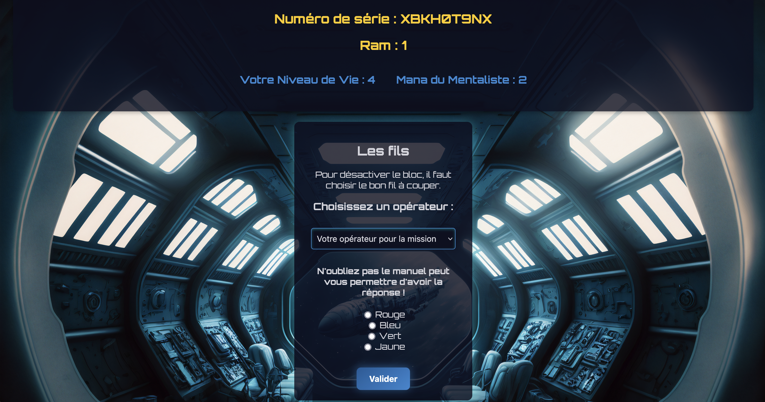
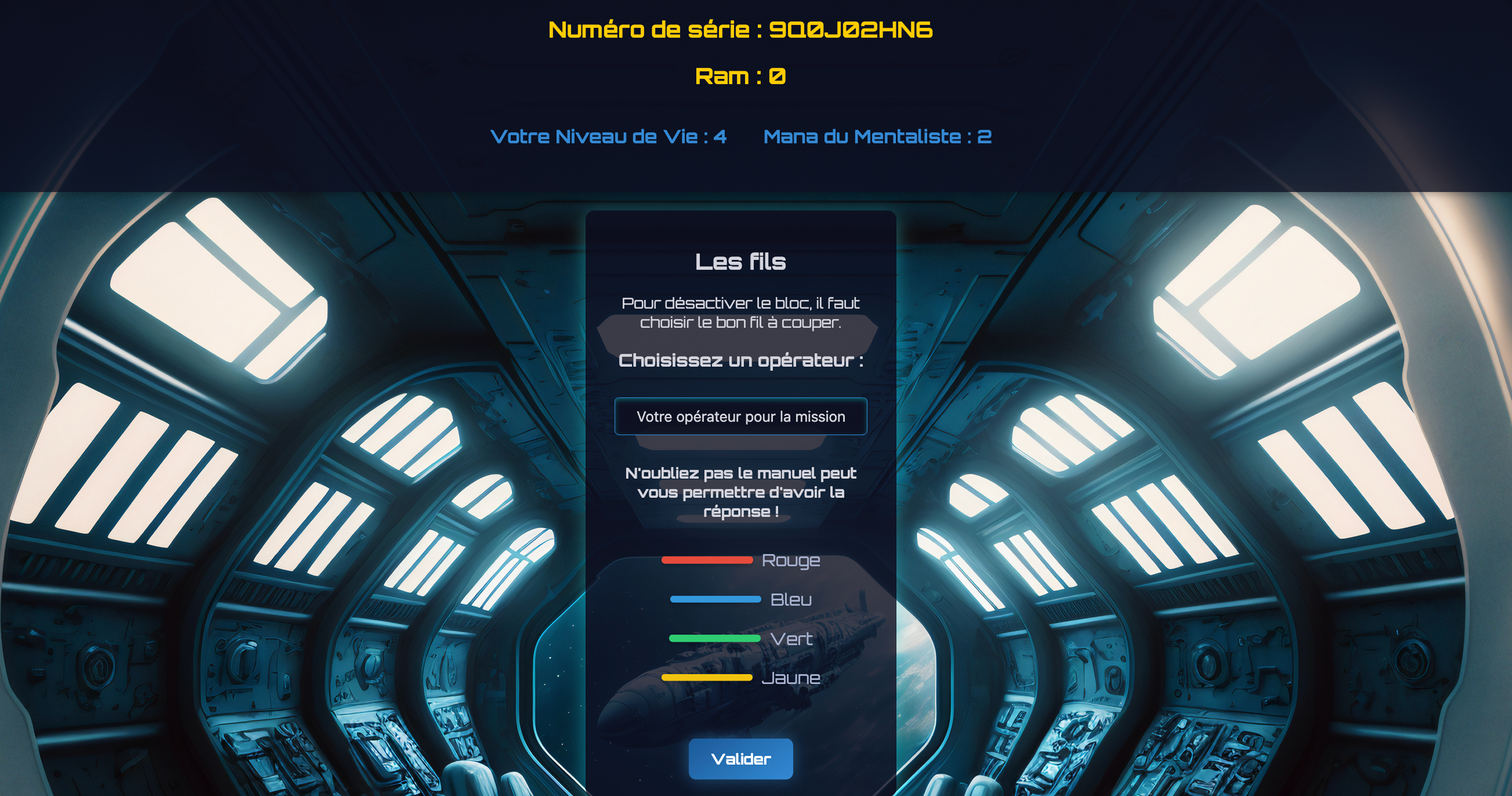
Save the Spaceship is a puzzle game where players must stop an AI named Chantale from taking over a spaceship. Built using Object-Oriented Programming (OOP), it features classes for the AI, ship systems, and challenges. The simple interface includes forms, buttons, and a clear display for health, mana, and key stats, ensuring smooth and strategic gameplay.
Feedback
- Improve User Interface : Enhance the design of various forms to make them more user-friendly and visually appealing.
- Revise Manual Layout : Improve the formatting and structure of the game manual for better readability.
- Unify Fonts : Standardize fonts across the game for a more cohesive and polished look.
The changes I apply
- Enhanced Form Interactivity : Made each challenge form more interactive and immersive by adding colors and formatting that match the theme of the challenge.
- Improved Manual Usability : Introduced a dropdown menu for each item, reducing information overload and making navigation smoother for users.
- Font Consistency : Updated button fonts to align with the overall game typography for a more cohesive design.

Click to see the Web Improved
Click to see the old version
Print Improved
Étretat Banners
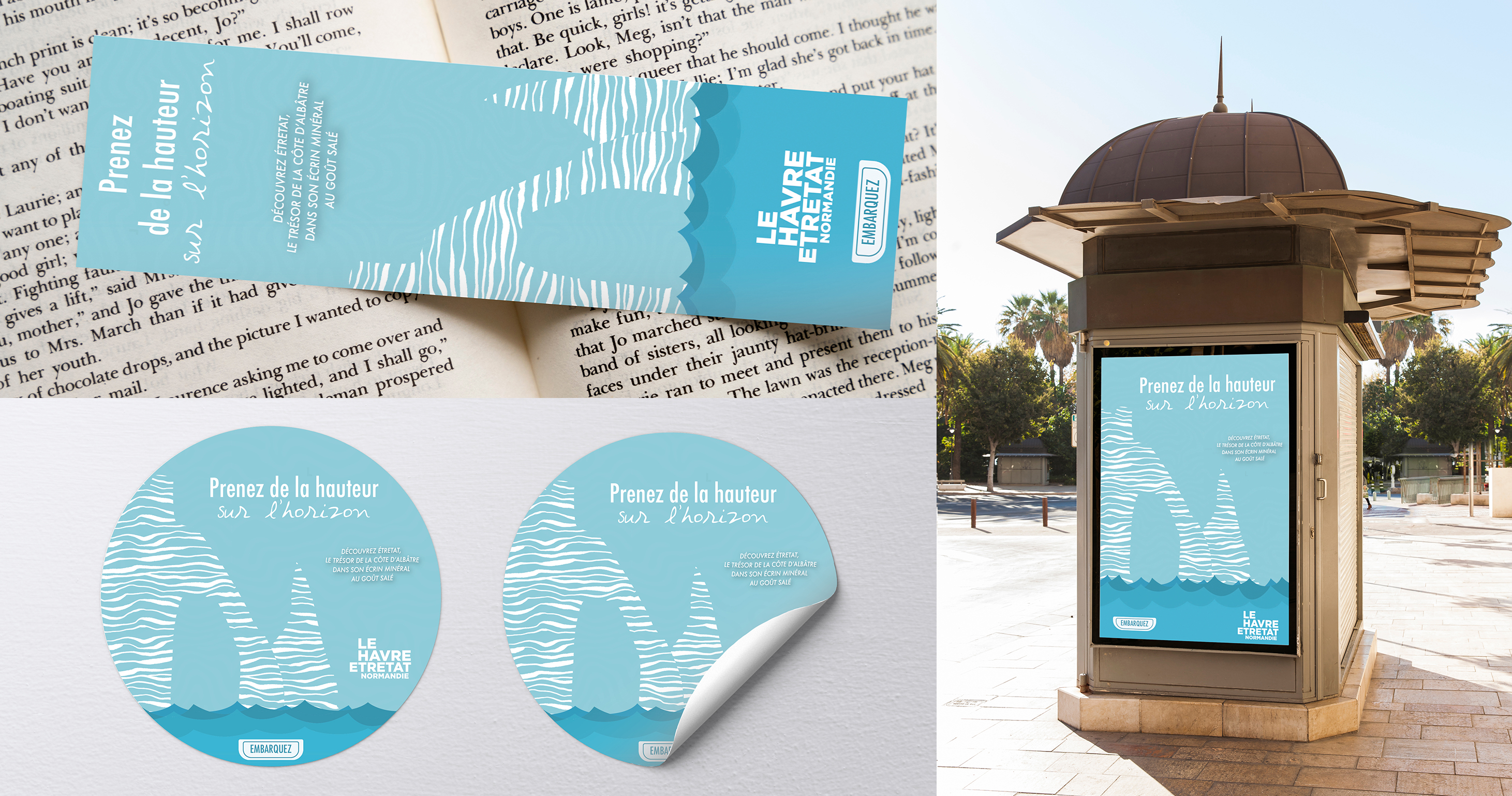
The Étretat Banners project involved creating an illustration for a banner while adhering to specific format constraints. The main task was to carefully crop the image to fit the required dimensions, ensuring the composition remained visually balanced and effective. The process included deciding which elements to keep or remove during cropping to maintain the image’s impact across different display contexts.
Feedback
- Resize the Logo : Adjust the logo size for better visual balance.
- Modify Color Tone : Change the color scheme to improve aesthetics and readability.
- Increase Text Margins : Add more spacing around the text for better readability and layout.
- Change Typography : Use a more readable font to improve clarity.
The changes I apply
- Adjusted the Blue Shade : Changed the color to a darker blue, reducing the turquoise tone.
- Updated the Font : Emphasized the beginning of the text for better impact.
- Rearranged the Quote : Modified its layout to make it more engaging.
- Increased Logo Size : Doubled the logo’s size for better visibility.
- Added Text Margins : Ensured proper spacing around the text for a cleaner design.
Click to see the Print Improved
Click to see the old version
Case study
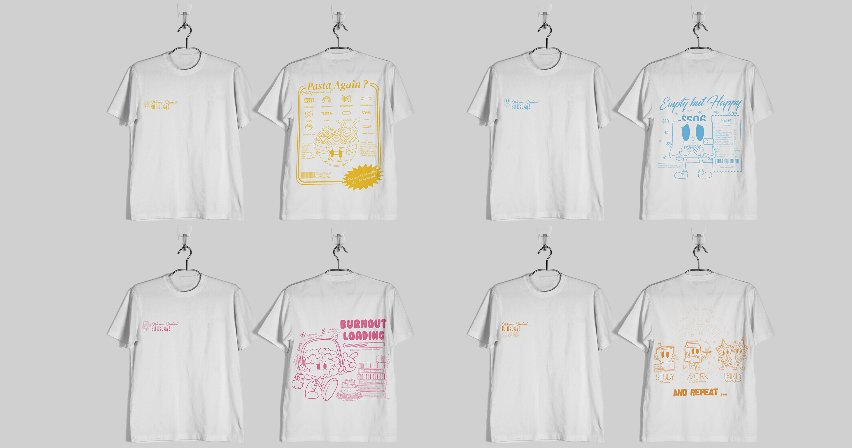
Personal Project
A collection of illustrated T-shirts that tell a humorous and self-deprecating tale of the realities of student life. From precariousness to dodgy food and system D, each visual transforms a shared hardship into a funny, colourful and (almost) desirable illustration.
Case study
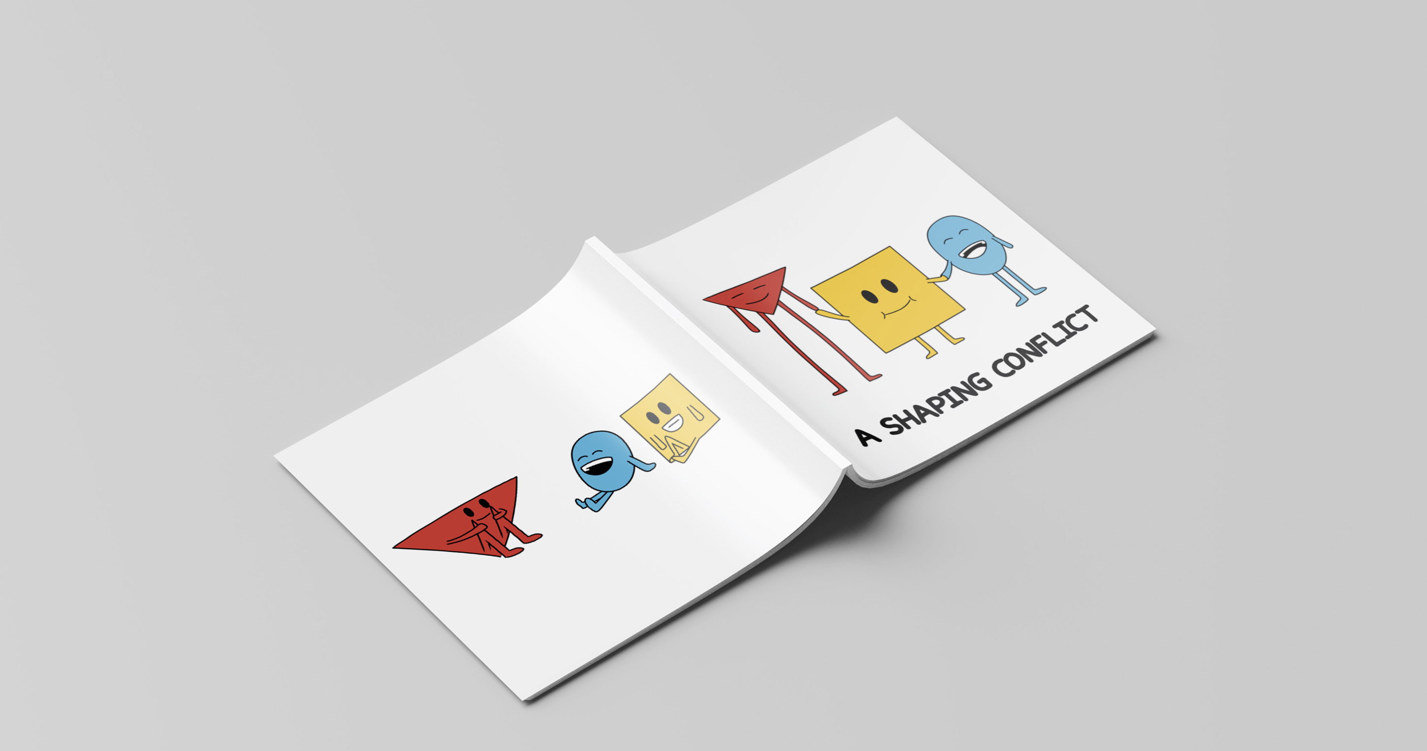
Psychology Project
A Shaping Conflict is a children’s book designed to help 3 to 6-year-olds understand and resolve everyday conflicts. Through colourful geometric characters and simple scenes, the story promotes empathy, patience, and cooperation. My role focused on layout design: organising the pages, harmonising visuals and text, and ensuring clarity and engagement for young readers.